Neendu
UX/UI design


A mobile app prototype for real-time infant vital signs monitoring designed to support SIDS prevention.
Neendu is a medtech startup, building an innovative system for monitoring infants’ vital signs as a way of helping prevent SIDS (Sudden Infant Death Syndrome). Until now, accurate measurements of this kind were only possible in a hospital. At home, parents had no access to any form of measurements and relied solely on their own observation. The lack of information about their child health status left them under stress and made it harder to catch the first warning signs.
- UX/UI Design
The neendu team needed a mobile app interface that would be easy to use. The app is meant to be used in very specific conditions: often at night, in a dark room, by someone who is tired and worried. The screens had to be as intuitive and legible as possible with minimal light. Because the app shows a child’s vital signs, the UX/UI design had to support the parent’s peace of mind and draw a clear line between ordinary information and an alert that calls for a response.
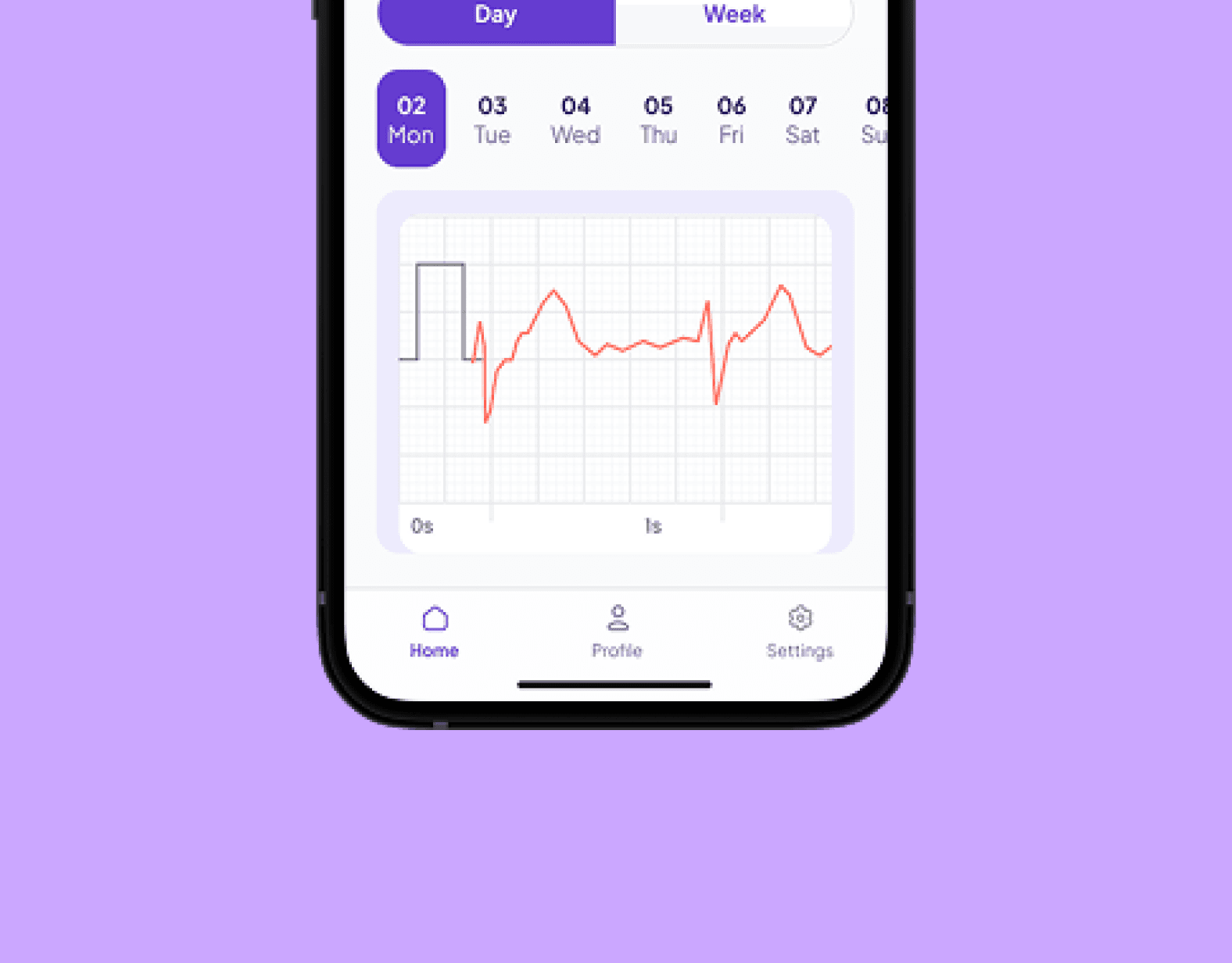

We created an interactive prototype of a mobile app that covers the full user journey and provides a solid basis for further development work on the product.
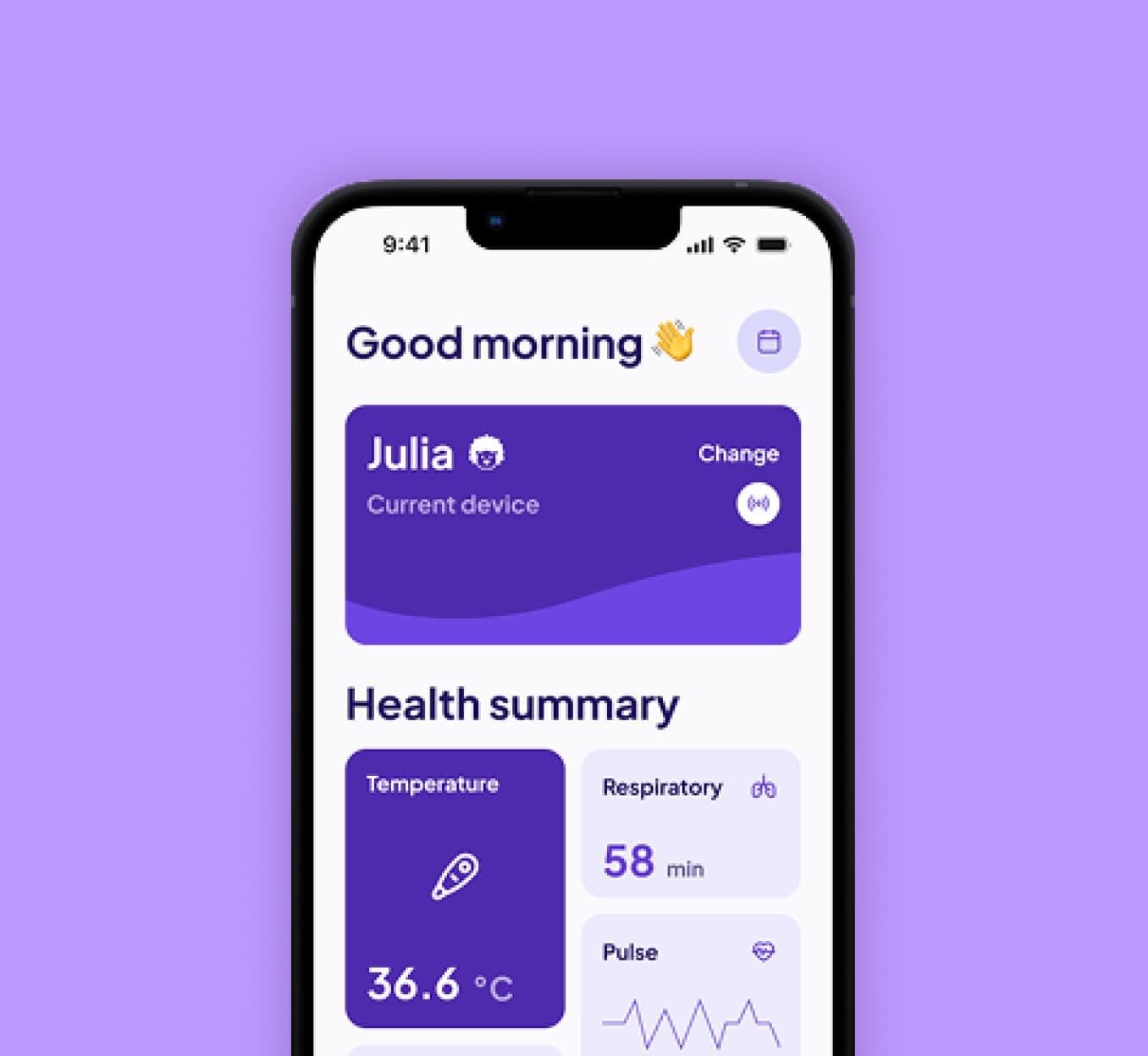
The neendu app makes it possible to follow a child’s vital signs in real time, and to go back to readings recorded over the past days and weeks. Parents see breathing, pulse, blood oxygen level and temperature both as a current reading and as a record over time, which helps them spot recurring patterns and prepare for a conversation with their doctor.
Many design decisions came down to the fact that parents reach for the app at night. The colour palette was chosen so that reading the data in a dark room is easy on the eyes. The interface is calm and free of unnecessary detail that might pull the parent’s attention away, and the most important information about the child stays visible right away, without having to go into further screens.
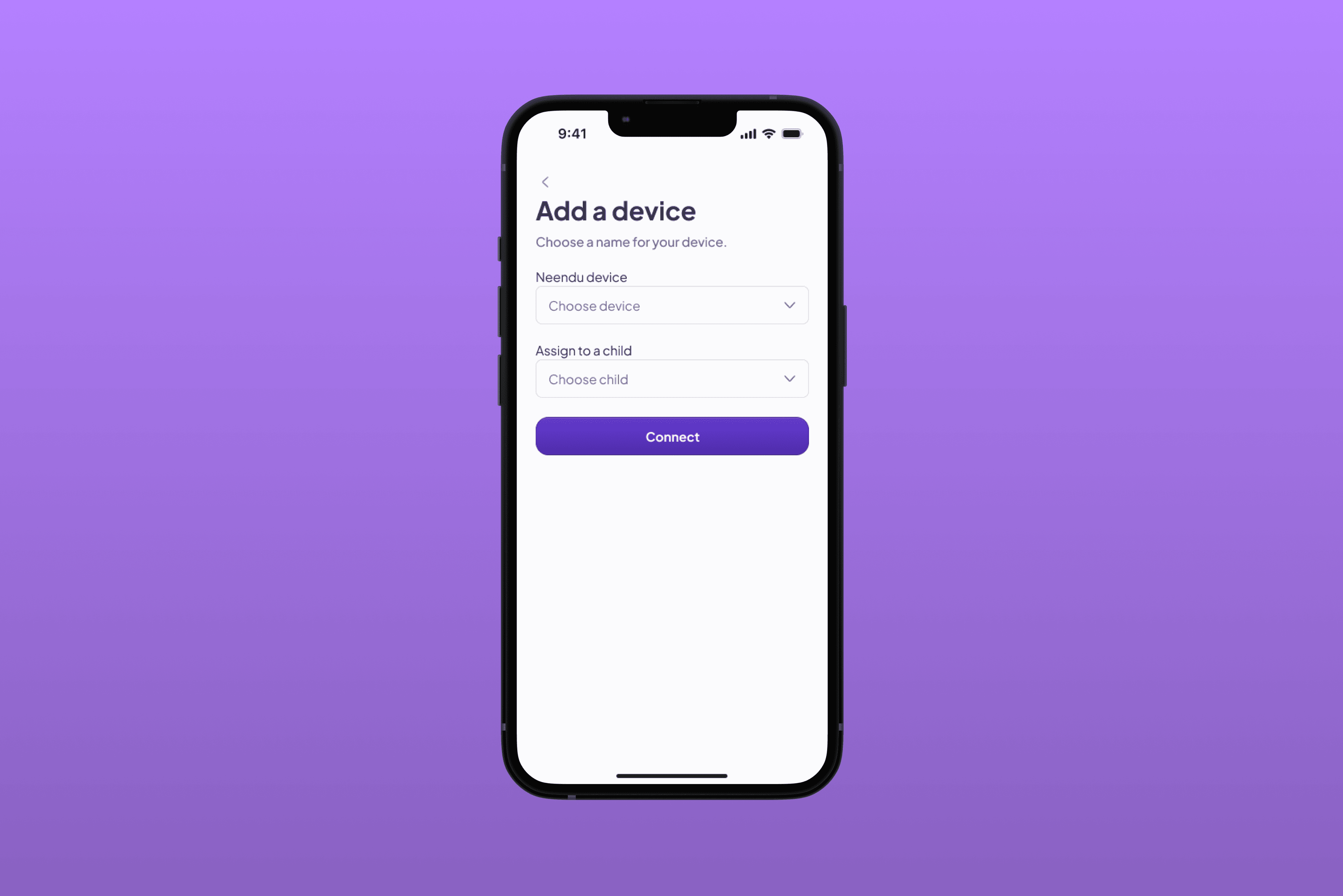
In the prototype we also designed the process of adding a child and assigning a monitoring device to them. Setup is guided step by step, so getting the system running does not feel like operating specialised equipment.
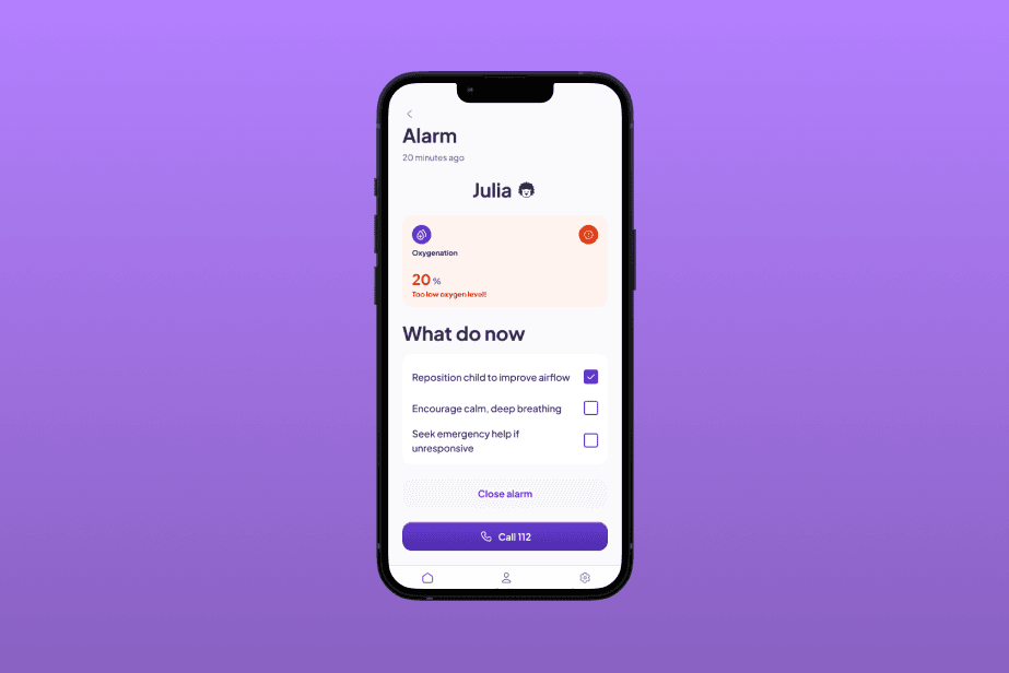
Alerts were a separate area of work. Notifications about readings outside the expected range spell out the situation clearly, yet in a way that does not cause panic. Parents get a plain description of what is happening, along with first-aid steps matched to the situation the app has picked up. On the same screen there is a button for calling the emergency number right away, if things turn critical.
The outcome of this collaboration is a UX/UI design in which the technology deliberately stays in the background. Parents get a tool that gives them a sense of control and calm in their everyday care, and one that takes them by the hand through each step when a response is needed.
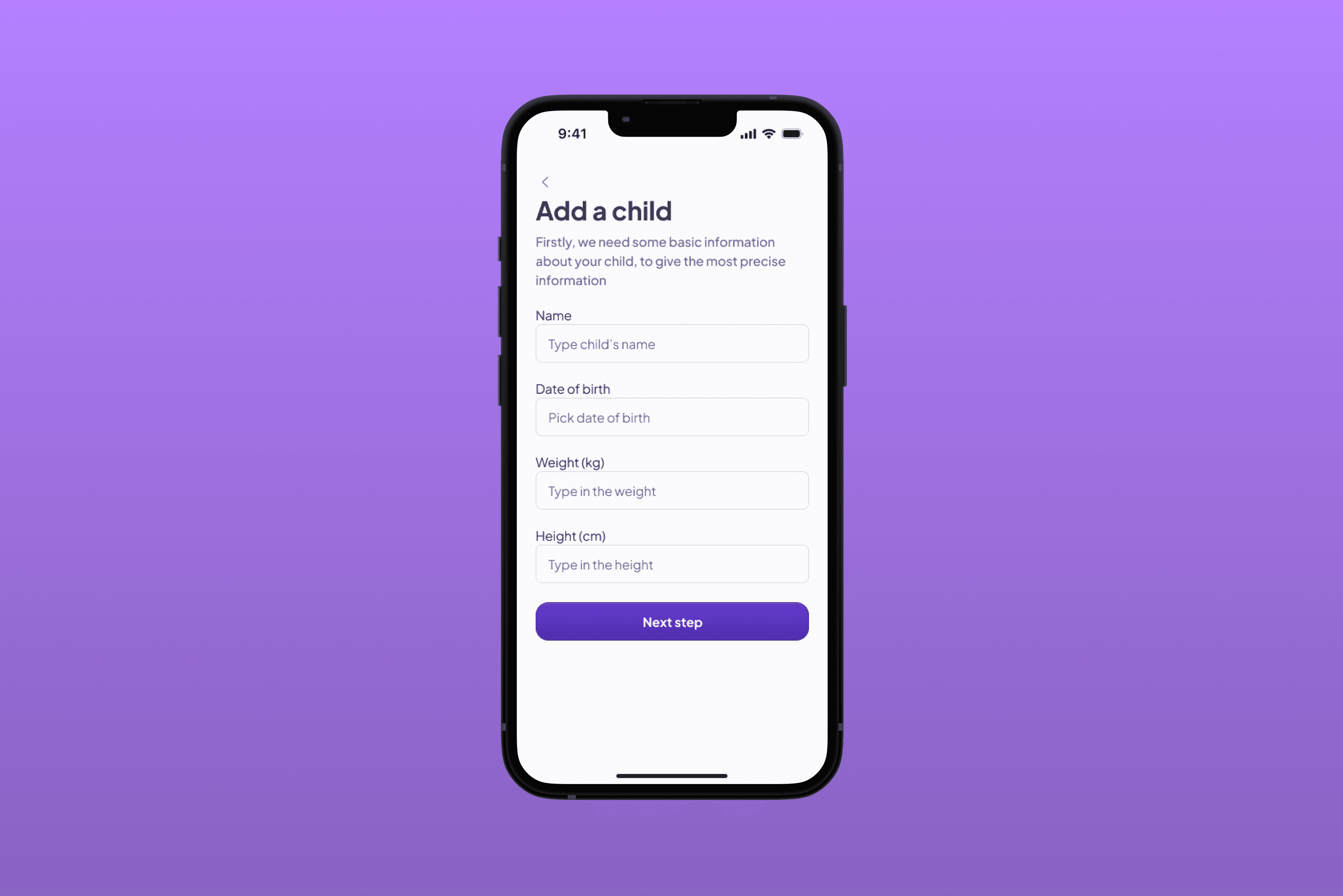
Add your child's details
Getting started with neendu begins with adding your child. Parents enter a few basic details and build the child’s profile in a handful of simple steps. The form is broken into short stages with a single question per screen, so setting things up never feels like filling in paperwork.
Once created, the profile becomes the place where all of the child’s readings collect. From the very first launch, parents know whose data they are looking at, and anything they entered can be topped up or corrected later in the profile settings.
We wanted this first encounter with the app to feel calm and welcoming. Rather than one long form, parents are walked through it step by step, with clear hints along the way and a plain indication of how far along they are.
Alert
When a child’s readings move outside the expected range, the app tells the parent straight away. The notification appears in a form that leaves no doubt about what is going on, yet stops short of causing panic. There is no guesswork involved: parents see which reading triggered the alert and what its current value is.
Below the description sit first-aid steps matched to the situation the app has picked up. They are laid out as short, consecutive instructions, so they can be followed one-handed and in a hurry, without wading through long blocks of text.
On the same screen we placed a button for calling the emergency number right away. In a critical moment, parents do not have to close the app or hunt around on their phone, and every alert stays in the history, so they can come back to it later and show it to their doctor.
Add a device
The neendu app works with a dedicated monitoring device, which parents add in a separate view. Entering the device number or scanning a code is enough to save it in the app and let it start sending readings.
Added devices land on a shared list, where each one is labelled clearly enough to tell them apart at a glance.
More than one device can be added to the app, and the list can be extended or tidied up at any time. Device names are editable, and any device the parent no longer uses can simply be removed.