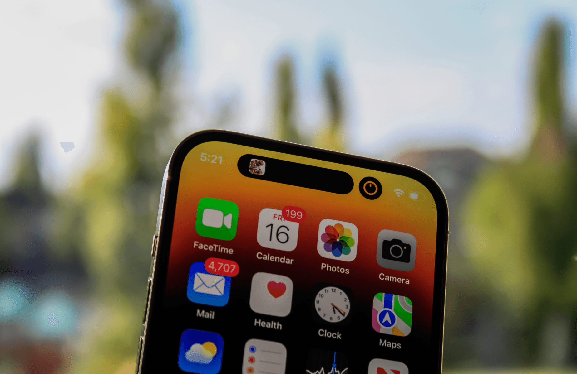
According to a new Forrester Research study, smartphones are set to impact 34% of total U.S. retail sales in 2018 (via internet research). That’s over $1 trillion. By 2022, smartphones will play a part in 42% of total retail sales.
There’s no denying that mobile is a growing e-commerce segment. The spread of mobile devices and new technologies that enable mobile payments make mobile commerce one of the top smartphone activities. Successful digital product design now means much more than ever. How to build good m-commerce UX?
The majority of e-commerce searches now happen on mobile. The multi-channel nature of e-commerce makes mobile optimization critical for online retailers who want to grow their businesses.
To provide an excellent user experience to customers browsing their store on smartphones, they need to take extra care in designing their mobile store. And that’s where UX comes in.
Here are 5 things you need to know about digital product design to make your m-commerce web application an instant success.
Do you want to create a digital product? Our team is ready to help you to find the optimal solution that will meet your specifications and achieve your business goals.
Get in touch with us1. Invest in information architecture
Information architecture (IA) is all about organizing and labeling sites to provide users with a highly usable platform where they can easily find what they’re looking for. Information architecture can make or break the customer’s journey toward purchase. It’s simple – if it takes too much time and effort to find the product they want, they’re simply going to try another store.
And don’t think it’s enough to have a search engine. Take a closer look at the buyer’s journey and understand the behavior of your customers. What is their typical buying pattern? What information do they look for first? Design your navigation by following a data hierarchy your customers prefer. Make browsing products as user-friendly as possible.
2. Offer filtering and sorting of best options
Consumers purchase from retailers who make it easy for them. Even if you’re looking to create a simple interface, getting rid of functionalities like filtering or sorting is a bad idea. They help users to navigate the site and find what they need as quickly as possible. Make sure that filtering and sorting is adapted to a given product category. Make sure that users can mark multiple product features.
3. Minimize steps to purchase
Make the buyer’s journey smooth and straightforward. Create a simple login/registration screen where the form contains only the most essential information. Don’t force consumers to waste their time and also energy on filling out a long form and minimize the number of fields. Include understandable buttons marked with the right color palette. A form like that will encourage users to explore your store and purchase from you.
4. Optimize your Calls-to-Action
Make sure that your CTAs are visible and clear. Make them big – that type of size ratio works great on mobile screens. Your CTAs need to stand out from the rest of the page – that’s something you can achieve using bright colors and surrounding them with white for excellent contrast.
A CTA needs to be easy to find, so place it in the center or the corners of the page. Keep it simple and use only a few powerful words to lure customers in.
5. Add mobile-first payment gateways
This part is essential for the success of your m-commerce application. You simply need a mobile-first payment gateway implementation. Otherwise, the process might be too complicated and cause high cart abandonment rates.
Make sure that users can purchase from you without having to register. It’s important to sketch the entire checkout journey. Always mark the customer’s position in it, so they know how many steps are left to complete. Display the total order value (together with shipping) throughout that process.
Expert tip: Sometimes customers may remember that they need to buy something else once they’re already going through the checkout process. Allow them to do that easily by including a handy button that takes them back to the store and keeps their shopping cart.
When it comes to mobile payments, security is paramount. Paying on smartphones may be perceived by consumers as less secure, but you can respond to that doubt effectively. Be sure to show bank or payment system logos and assure customers that your m-commerce app is fully secure.
M-commerce UX is the future
Mobile shopping is the fastest-growing segment among smartphone users. Last year, it went up by a smashing 54%.
Online retailers need to start paying attention to their mobile apps, starting now.
Do you have an idea for an m-commerce app with an excellent and converting digital product design?


